I think this is a good design because its not hard to look at, and even though there are several images on the screen the amount of colors is limited. Another good thing about this design is that their is only one font which makes it very consistent throughout the image. Areas where I think this may have fallen short of the master designer principle is where the male figure is close to the handicap image and it looks kind of cluttered.
http://www.google.com/imgres?q=signs&um=1&hl=en&client=firefox-a&sa=N&rls=org.mozilla:en-US:official&biw=1117&bih=607&tbm=isch&tbnid=_MusHBXYsxj3FM:&imgrefurl=http://www.naagtag.com/restroom-signs-bathroom-signs.html&docid=mII4DkvuFSH_QM&w=600&h=600&ei=3j-FTuOXC5ODtge4lZ0z&zoom=1
Thursday, September 29, 2011
Tuesday, September 27, 2011
Hats and Scarves
For this picture I chose the font Traveling Typewriter and Throw my Hands up in the Air. For Hats and Scarves I wanted to make it a fun font so it would draw the viewers attention to the magazine. For Monthly, I wanted to go for a more bold look and I put it all capital letters to make it stand out more.
Thursday, September 22, 2011
Texture Blending Blog Post
For this picture of the eagle I blended it with the red yellow metal photo and and had an overlay layer with an opacity of 98% and a fill of 100%.
Tuesday, September 20, 2011
Friday, September 9, 2011
Monday, September 5, 2011
Photo Story
The photo story that I chose is "Sorority Life." I am apart of Sigma Sigma Sigma Sorority and I love it. I have met so many great girls who are all different yet who have the same interests as me. I love being apart of a sorority because through Sigma I can volunteer more often, get to know more people, and be apart of something special. I plan to shoot it outside of our Sorority house with girls from my Sorority. I would like to have all of my pictures taken by this Thursday. One photo that I want to capture as my lead photo is having a bunch of my sisters together laughing, having fun, and encompassing what a sorority is all about. I want my photo to self explain what being apart of a sorority is all about.
Thursday, September 1, 2011
Adjustment Layers
Before Picture
After Picture
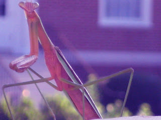
- I adjusted the picture using Brightness. I changed the color of the picture so there is more of a red tint.
Before Picture
After Picture
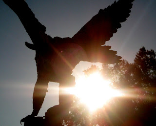
I adjusted the picture of the eagle using levels. I darkened the eagle and the trees, and gave the sky a grayish tint.
After Picture
- I adjusted the picture using Brightness. I changed the color of the picture so there is more of a red tint.
Before Picture
After Picture
I adjusted the picture of the eagle using levels. I darkened the eagle and the trees, and gave the sky a grayish tint.
Subscribe to:
Comments (Atom)


