Monday, November 21, 2011
Video Project Proposal
For my project I will be working with Meaghan McRee and Kirsten Hunter. We will be doing a How to Video on how to cook something or how to craft something. This would allow for really good close up shots to show detail and wide shots to show different perspectives. We would all edit the video together, and I be on camera and that Kirsten and Meaghan would shoot.
Tuesday, November 15, 2011
Flat vs. Depth Blog
The film that I think represents one of the theories discussed in the Temple of the Seven Golden Camels is The boat That Rocked because the way that the camera is angled it creates dynamic angles within the frame. I think it reflects the theories because each picture is shot at a different angle making the shots more dynamic.
http://framefilter.blogspot.com/2009/05/boat-that-rocked.html
http://framefilter.blogspot.com/2009/05/boat-that-rocked.html
Wednesday, November 9, 2011
Remixing Editing Project
The movie that I chose to do is The Shawshank Redemption starring Tim Robbins and Morgan Freeman. I own the DVD so I can take scenes from the actual movie. There is one scene in my movie that I want to remix, its comes after Morgan Freeman is released from Shawshank prison and he is going to find his friend. Tim Robbins tells him to go to this old tree and look for a certain brick that has an old box buried under it. I want to make the movie more happy and less of a movie about men who will never get out of prison.
Thursday, November 3, 2011
Audio Project Blog
My partner for this project will be Chloe. For our project we are doing How the Grinch Stole Christmas. The conflict in the story is that the Grinch steals all of the presents from the people of Who-Ville. We downloaded Christmas music and sounds to play throughout the audio.
Tuesday, October 25, 2011
Vox Pop Proposal Blog
The question that I chose for my interview was: If you could do anything in the world what would you do?
I chose this question because most people have a dream of what they want to be when they grow up but they may never get a chance to achieve that goal. I think listeners would like to listen to what other people's goals are. It's a chance for people to tell others what they would really like to do in life.
I chose this question because most people have a dream of what they want to be when they grow up but they may never get a chance to achieve that goal. I think listeners would like to listen to what other people's goals are. It's a chance for people to tell others what they would really like to do in life.
Thursday, October 6, 2011
Pawprint Blog Post
I think this palette is effective because I think all the blues really make the pawprint pop out. Everytime I think of a pawprint I always associate it with being blue.
Wednesday, October 5, 2011
Logo Design Process Blog Post
My intended audience for my logo are young female adults and teenagers. I want my audience to see my logo and be interested in my designs. One word to describe my logo would be preppy, because all the designs are very girly and cute. I think the whale would fit on a business card because since there is only one element to it and its very simplified, it would be easy to read.
Thursday, September 29, 2011
Text Design Blog Post
I think this is a good design because its not hard to look at, and even though there are several images on the screen the amount of colors is limited. Another good thing about this design is that their is only one font which makes it very consistent throughout the image. Areas where I think this may have fallen short of the master designer principle is where the male figure is close to the handicap image and it looks kind of cluttered.
http://www.google.com/imgres?q=signs&um=1&hl=en&client=firefox-a&sa=N&rls=org.mozilla:en-US:official&biw=1117&bih=607&tbm=isch&tbnid=_MusHBXYsxj3FM:&imgrefurl=http://www.naagtag.com/restroom-signs-bathroom-signs.html&docid=mII4DkvuFSH_QM&w=600&h=600&ei=3j-FTuOXC5ODtge4lZ0z&zoom=1
http://www.google.com/imgres?q=signs&um=1&hl=en&client=firefox-a&sa=N&rls=org.mozilla:en-US:official&biw=1117&bih=607&tbm=isch&tbnid=_MusHBXYsxj3FM:&imgrefurl=http://www.naagtag.com/restroom-signs-bathroom-signs.html&docid=mII4DkvuFSH_QM&w=600&h=600&ei=3j-FTuOXC5ODtge4lZ0z&zoom=1
Tuesday, September 27, 2011
Hats and Scarves
For this picture I chose the font Traveling Typewriter and Throw my Hands up in the Air. For Hats and Scarves I wanted to make it a fun font so it would draw the viewers attention to the magazine. For Monthly, I wanted to go for a more bold look and I put it all capital letters to make it stand out more.
Thursday, September 22, 2011
Texture Blending Blog Post
For this picture of the eagle I blended it with the red yellow metal photo and and had an overlay layer with an opacity of 98% and a fill of 100%.
Tuesday, September 20, 2011
Friday, September 9, 2011
Monday, September 5, 2011
Photo Story
The photo story that I chose is "Sorority Life." I am apart of Sigma Sigma Sigma Sorority and I love it. I have met so many great girls who are all different yet who have the same interests as me. I love being apart of a sorority because through Sigma I can volunteer more often, get to know more people, and be apart of something special. I plan to shoot it outside of our Sorority house with girls from my Sorority. I would like to have all of my pictures taken by this Thursday. One photo that I want to capture as my lead photo is having a bunch of my sisters together laughing, having fun, and encompassing what a sorority is all about. I want my photo to self explain what being apart of a sorority is all about.
Thursday, September 1, 2011
Adjustment Layers
Before Picture
After Picture
- I adjusted the picture using Brightness. I changed the color of the picture so there is more of a red tint.
Before Picture
After Picture
I adjusted the picture of the eagle using levels. I darkened the eagle and the trees, and gave the sky a grayish tint.
After Picture
- I adjusted the picture using Brightness. I changed the color of the picture so there is more of a red tint.
Before Picture
After Picture
I adjusted the picture of the eagle using levels. I darkened the eagle and the trees, and gave the sky a grayish tint.
Monday, August 29, 2011
Photographic Composition
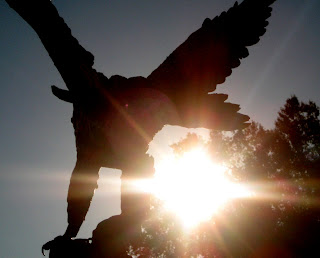
Simplicity: This bird represents simplicity because by having the sun come in under the right wing it makes the eagle stand out more and your focus stays right on the eagle.
Rule of Thirds: This picture demonstrates the rule of thirds because the image creates one focal point, using the rule of thirds. The picture is not very busy, and there are not distracting images in the background that take your eyes away from the picture. Since the picture is close up and in the left hand corner, you can clearly examine the image with no distractions in the background.
Lines: This picture demonstrates the element of lines in photography, through its use of diagonals forcing the eye to focus on the center of the tire. This directs the eye to the BMW symbol (focal point).
Framing: This image exemplifies the element of framing, through the lines that the panels of the archway create. The archway frames the balcony and its architectural importance to the Communications building. The angle at which I took the picture helps creates a greater sense of depth.
Thursday, August 25, 2011
Statue
I chose this photo because I think the way she's positioned and her hand movements say a lot. The photo I took at the beginning of the class was from far away and there were distractions in the background that were leading your eyes to somewhere other than the photo. I think this photo improves from the last one because its zoomed in and your eyes only stay on the statue, and you can see theres a lot of expression in her face.
Tuesday, August 23, 2011
Welcome
Hey! Throughout the semester I would really like to get familiar with iMovie, how it works and the different applications you can do with it. iMovie seems very useful and I would really like to learn how to make my own movies.
Subscribe to:
Comments (Atom)


